
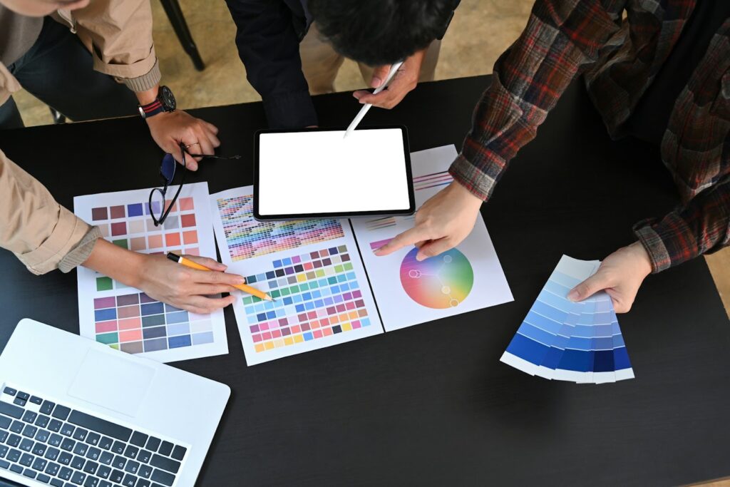
First impressions matter and in the world of branding, color plays a bigger role than most realize. Whether it’s the red of Coca-Cola or the golden arches of McDonald’s, color is often the first thing people notice about a brand. When it comes to custom merchandise, your color choices are more than just aesthetic; they’re psychological, strategic, and personal. Let’s dig into how you can make the smartest color choices for your custom merch and turn heads (in a good way) every time someone sees your brand.
Table of Contents
Why Color Isn’t Just A Vibe
When choosing merch colors, many people fall into the trap of picking what looks cool or what their team likes. While that’s not inherently wrong, it’s not strategic either. Your brand’s colors should reflect your identity, tone, and market. Colors communicate. Blue signals trust and professionalism. Red evokes excitement and urgency. Green often conveys growth, eco-consciousness, or freshness. Each color triggers emotions and perceptions that either support or undermine your branding goals. So before you settle on a trendy pastel or bold neon, think about what you want people to feel when they see your merch. The emotional impact is key.
Matching Merch With Your Brand’s Personality
Take a moment to consider your brand personality. Are you fun and quirky? Sleek and modern? Bold and aggressive? Subtle and earthy? Once you’ve nailed that down, you can translate those traits into color choices that align with your message and audience.
For example, a fun and youthful brand might benefit from bright, saturated colors like turquoise, orange, or lime green. A professional and trustworthy brand may find navy blue, charcoal, or white more appropriate. Luxury brands often lean toward deep shades like burgundy, emerald, or matte black with metallic accents. Brands with an eco-conscious or grounded vibe tend to go for earth tones such as tan, olive, and dusty blues.
The colors you choose should act as a silent ambassador for your brand’s vibe.
Psychology That Sells
Color psychology isn’t just marketing fluff, it’s backed by behavioral science. Studies show that up to 90% of quick judgments made about products are based on color alone. This means that the colors you use on employee swag, client gifts, or giveaway items could directly affect how people perceive and respond to your brand.
Different colors carry different connotations. Red tends to represent action and urgency. Blue conveys trust and reliability. Yellow signals optimism and creativity. Black is seen as sophisticated and exclusive. White represents cleanliness and simplicity. Orange is energetic and approachable, while green evokes nature and wellness. When selecting merch colors, consider the message you want to send and the emotion you want to elicit.
When to Break the Rules
Sometimes, sticking strictly to your brand colors can feel limiting. Fortunately, custom merch gives you the freedom to experiment a little. Special editions tied to campaigns, seasons, or cultural moments are perfect opportunities to play with new hues.
Whether it’s a pastel hoodie for spring, rainbow accents for Pride Month, or vintage tones for a retro look, you can shake things up while still staying on-brand. The key is consistency. Use your logo or a signature accent color to tie everything together, so the overall look still feels like you.
When done thoughtfully, this kind of color variation can make your merch more engaging and give people a reason to collect or wear different versions.
Fabric Colors vs. Thread Colors
In embroidery and screen printing, not all color combinations work well. The way your logo looks on screen won’t always translate the same way onto fabric. A dark thread on a dark shirt becomes invisible. A neon logo on a light cap may feel overwhelming. Even tone-on-tone, like white-on-white, can be hard to read unless the texture stands out.
Aim for clear contrast between the fabric and thread colors, but also make sure the colors don’t clash. Consider how your primary and secondary brand colors will look when stitched onto different materials. Ask your vendor for samples or swatches to preview how combinations will turn out in real life.
And remember colors on a screen can differ from real-life shades, so always test before finalizing an order.
Trending or Timeless?
Trendy colors can be exciting, but they don’t always age well. If your merch is meant to be worn regularly by employees, event staff, or loyal customers you may want to prioritize timeless appeal.
Classics like black, white, navy, and gray have staying power and tend to pair well with most logos. That doesn’t mean you have to avoid trends altogether. Incorporate trending shades as accents, limited runs, or seasonal updates.
Finding a balance between current styles and brand longevity can help your merch feel fresh without becoming quickly outdated.
Make It Wearable
Just because a color looks good on paper doesn’t mean people will wear it. Think beyond your brand and consider how the final product fits into a person’s wardrobe. Bright colors might be eye-catching, but will your team or customers wear them confidently?
Base your merch on neutral tones like black, white, or gray, and then layer in brand colors through logos, trims, or small details. This makes your merch more wearable across different contexts while still keeping your branding visible.
Oak and Twine turns your business logo into high-quality, custom-embroidered gear your team will wear with pride. But making your merch wearable starts with smart, practical color choices.
Tips for a Solid Color Strategy
Limit your palette to 2–3 colors to avoid clutter. High contrast helps your logo pop, so pair dark backgrounds with light logos and vice versa. Always think about where and how the merch will be used. Outdoor gear might need brighter hues for visibility, while indoor uniforms can lean more subdued.
Ask your team or audience what they’d like to wear, you might be surprised by their preferences. And never skip the sample phase. Seeing and touching the final product helps catch issues early and ensures the result is exactly what you envisioned.
Ready to Pick Your Palette?
Your merch colors can make or break how people perceive your brand. The right palette doesn’t just look good; it creates emotional connections, strengthens recognition, and boosts pride in wearing your brand. Whether you’re designing apparel for your team, swag for clients, or giveaways for events, choose your colors with intention.
Go beyond trends and build a palette that truly represents your brand’s values and personality. It’s time to pick your colors, make a statement, and show off your brand in style.


Leave a Reply